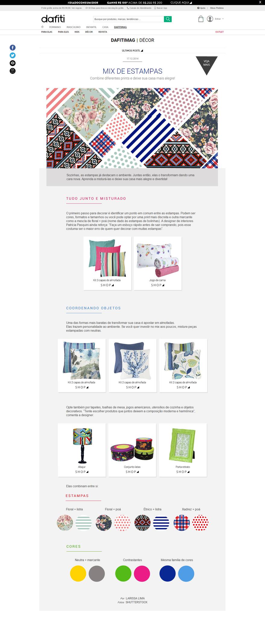
Mix & Match!
Some prints by themselves can upgrade any environment easily. Combining two or more, they transform your decoration into a new face. Learn how to mix and match them to leave your home much more stylish!
Putting it all together
The first step is starting identifying a common spot between the prints which can be colors, formats, and scales. You can choose, for example, one neutral print and another dominate print, for example, the floral blend + polka dots. The interior designer Patricia Pasquini still reinforces: "make a quick sketch before you go shopping because this is usually the biggest mistake of those who want to decorate with different prints."
Coordinating things
One of the cheapest ways to turn your home is to go on pillows because they bring personality to the environment. If you want to invest in some mix gradually combine printed items with neutral colors.
Also opt for rugs, tablecloths, placemats, kitchen utensils, and decorative objects. "Try to choose pieces that together leave the production modern and harmonic," says the interior designer.
They match each other:
Prints
Floral + Floral Stripe + Polka dots
Ethnic + stripe
Chess + Polka dots
Colors
Neutral + Colorful
Contrasting colors
Same color family
*Article originally published in Portuguese, to see it follow the link below:
users/49974/images/3a6ab2aa-23f4-4300-887a-9bfee607ce0b.png
